
Custom data visuals — posters, infographics and videos
We turn data into clear, striking graphics and narrated data videos, using the same design system and production pipeline behind the Everything Econ channel. Tell us what you need to show and we will scope it with you.
What we make
One studio for static and moving visuals, in our house style or any colour scheme you choose.
Graphics and infographics
Charts, maps and specialist layouts for reports, decks, articles and social posts, in any colour scheme or theme, light or dark, including your brand palette.
Posters and print
Large-format, print-ready pieces for offices, classrooms, events and merchandise, supplied as PDF at print resolution.
Data videos
Animated maps, rankings and treemaps that move through time, from 30-second social cuts to long-form explainers.
Sample work
A selection of recent pieces across the formats we offer.
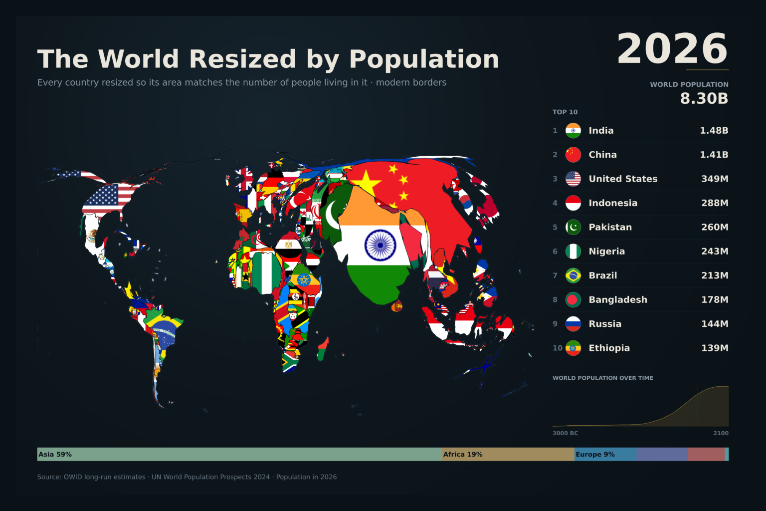
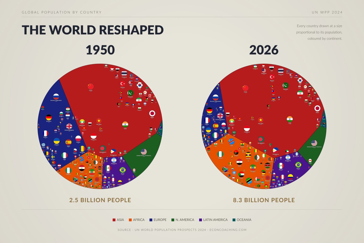
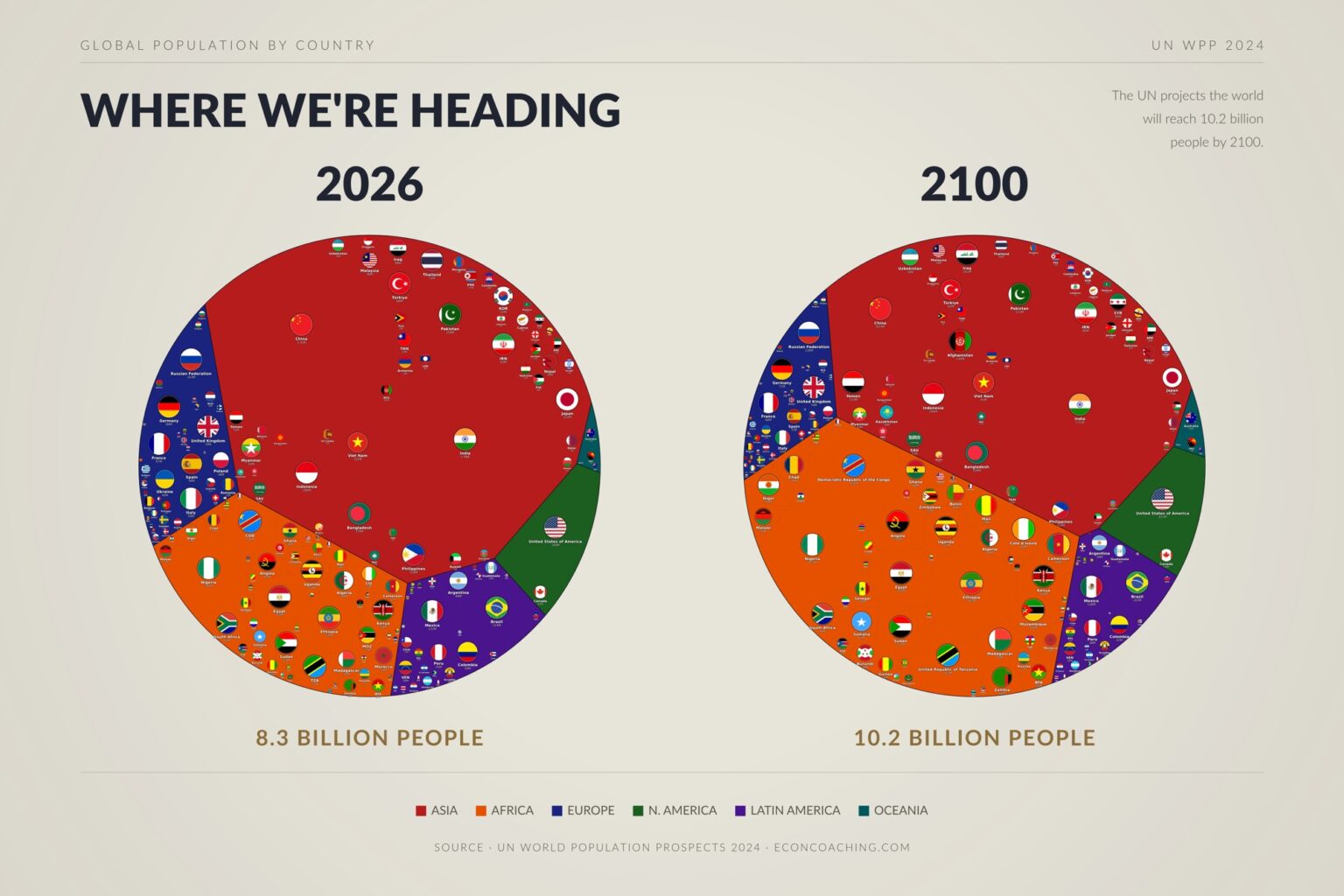
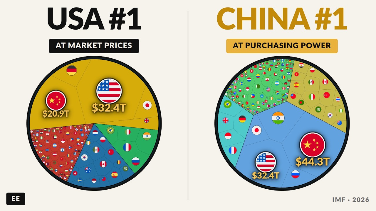
Graphics and posters
Full graphics, dark and light. Every piece can be produced in any colour scheme. Click to view at full size.
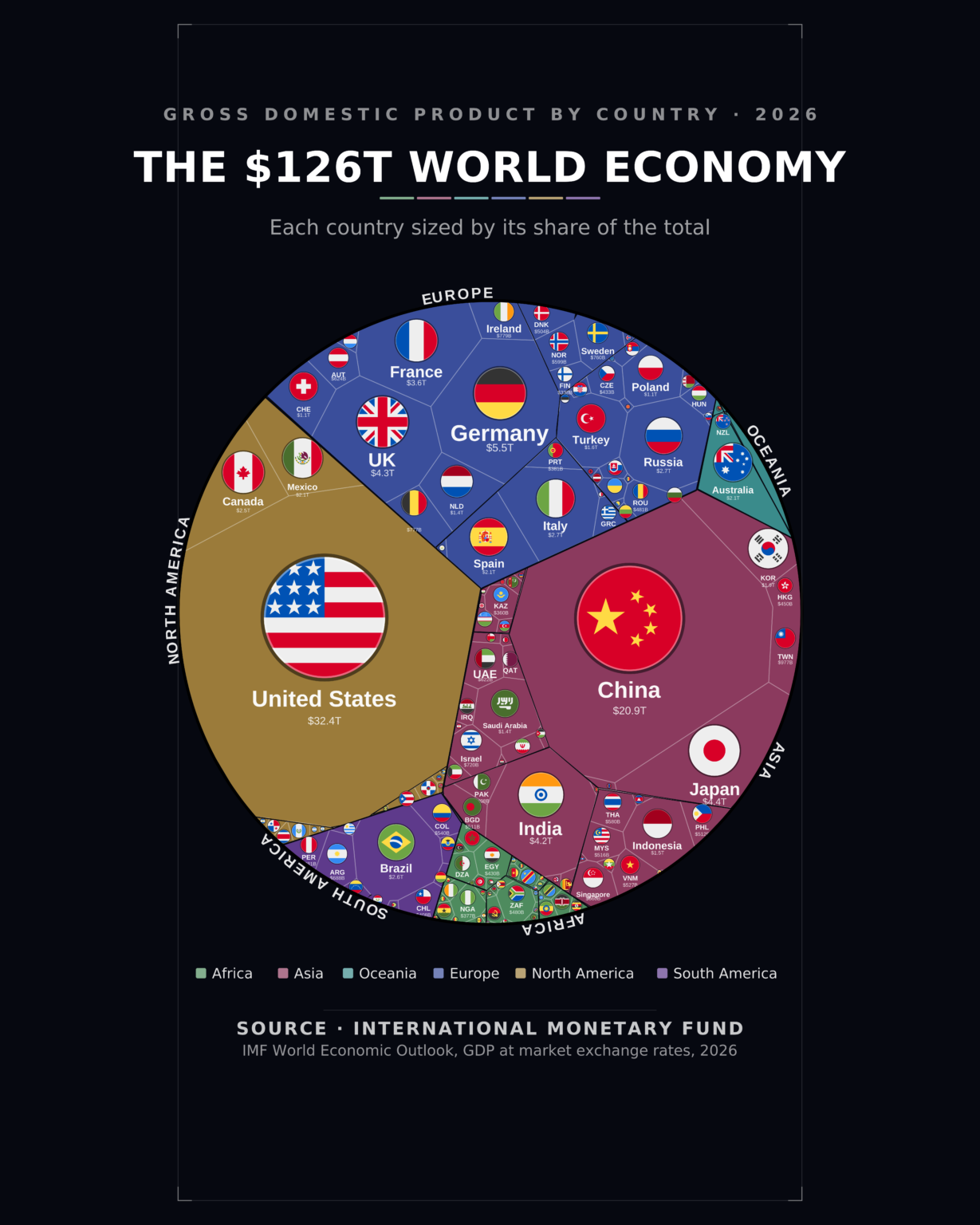
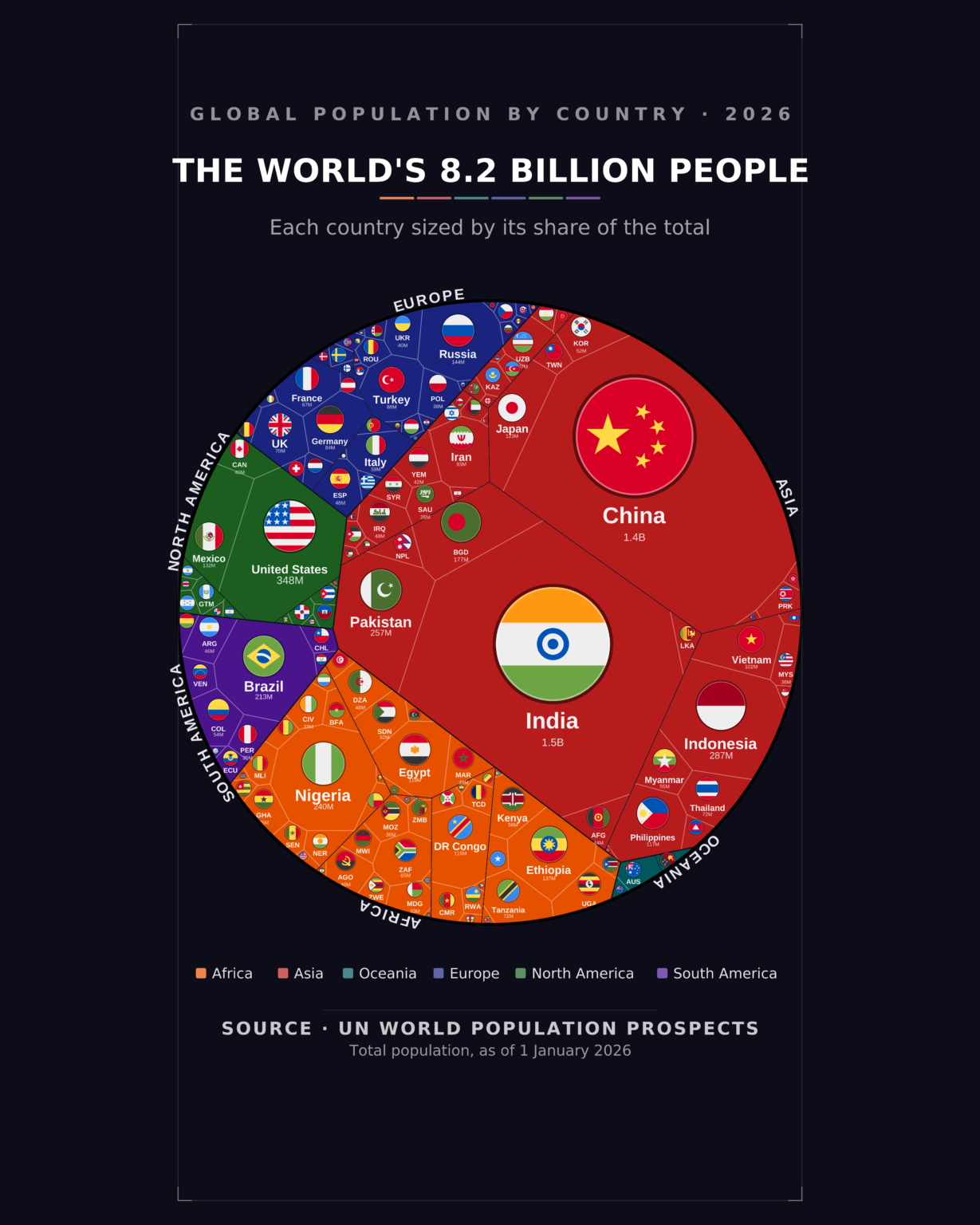
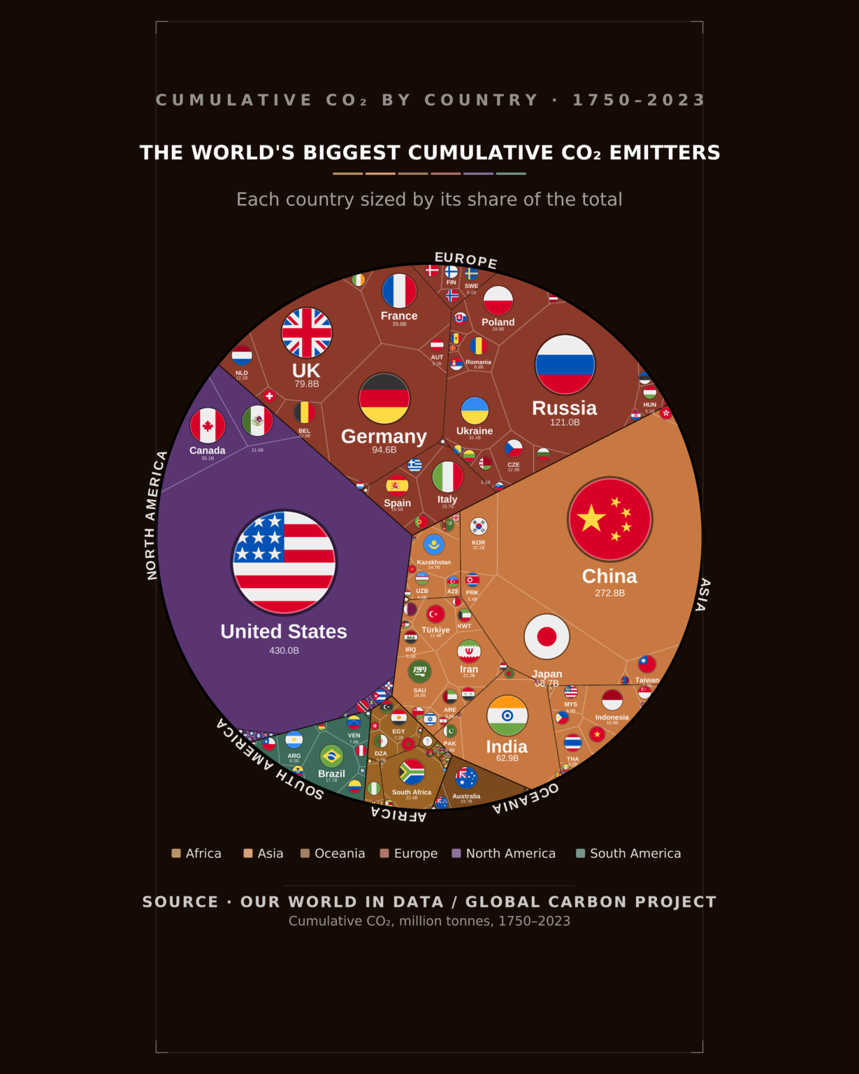
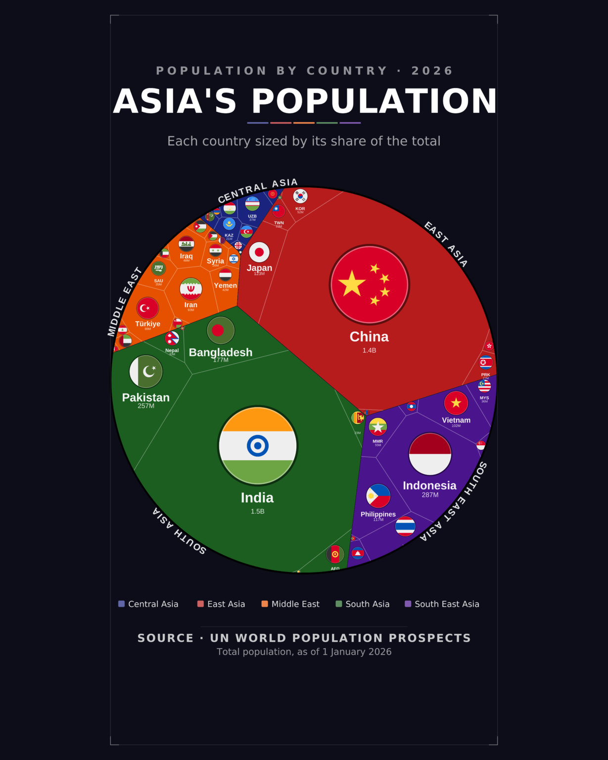


Data videos
Short-form cuts in 9:16. Press play to watch.
Long-form: see the MAPPED series on YouTube, including The World Map Resized by Economy: 1820 to Present.
All samples are Everything Econ’s own published work, made for our channels and shop rather than for clients.
How it works
Every commission starts with a short conversation, so the quote reflects what you actually need.
Enquire
Send a brief, or use the calculator for an indicative price.
Scope
We agree data, format, length, voiceover and deadline by email or call.
Quote
You receive a fixed price and timeline to approve.
Preview
We share a draft; you request changes within your revision rounds.
Deliver
Final files arrive by email in the formats agreed.
How our pricing works
The prices below are indicative starting points. Your final price is fixed in a written quote after we have agreed the scope together.
What moves the price
Whether the data is ready or needs sourcing, the number of charts or the running time, how much research and scripting is involved, voiceover, branding, licence and turnaround.
When you can buy outright
Single graphics with clean data and a clear brief can be bought at the package prices without a call. Everything else, including all video, is quoted first.
Graphics and infographics
Indicative prices per package.
| Basic | Standard | Premium | |
|---|---|---|---|
| Statistical charts (bar, line, scatter, bump…) | from £35 | from £75 | from £150 |
| Specialist (Voronoi, cartogram, alluvial, map…) | from £65 | from £110 | from £150 |
| Charts included | 1 | up to 3 statistical or 1 specialist | up to 5 statistical or 1 specialist |
| Files | PNG (web + print) | PNG + SVG + print-ready PDF | PNG + SVG + PDF + editable source |
| Colours and branding | House style or any colour scheme | Your colours and fonts | Full brand kit |
| Revision rounds | 1 | 2 | 3 |
| Typical turnaround | 5 working days | 4 working days | 2–3 working days |
Typical extras: additional chart £20 · data tidying £25 or full wrangling £50 · interactive web version £100 · commercial licence £25 · extra revision round £15 · rush delivery from £40. Posters and print sizes are quoted per job.
Data videos
Indicative prices. Every video is scoped with you before we quote.
| Short | Standard | Feature | Long-form | |
|---|---|---|---|---|
| Indicative price | from £300 | from £500 | from £1,500 | quoted per project |
| Running time | about 30 seconds | about 60 seconds | 2–3 minutes | 8–15 minutes |
| Data | You supply it | You supply it, or we source one metric | Multi-source research, cross-checked | Full research |
| Script | On-screen captions | Written and sourced | Written, structured and fact-checked | Full narrative script |
| Voiceover | Optional | House narrator included; options below | House narrator included; options below | Agreed in scoping |
| Formats | One aspect ratio | 16:9 and 9:16 | 16:9, 9:16 and stills | 16:9 plus agreed cut-downs |
| Revision rounds | 1 | 2 | 3 | Agreed in scoping |
| Typical delivery | 5 working days | 7 working days | 14 working days | Agreed in scoping |
Typical extras: extra subtitle language £60 · extra aspect-ratio cut £75 · matching print poster £120 · professional human voice artist at cost · rush delivery +50%.
Fixed graphic packages
For a single graphic with clean data, you can order directly and upload your brief at checkout.
Statistical and chart graphics
- Bar, line, scatter, pie and distribution charts
- Designed to your brand from Standard
- PNG, SVG and PDF; source files on Premium
Specialist visualisations
- Voronoi treemaps, network graphs, cartograms and maps
- Presentation and print ready
- PNG, SVG and PDF; source files on Premium
Just want one for yourself? A channel piece is a single graphic (£29) or short video (£79) on a dataset you choose, made in the Everything Econ house style for personal use with one revision round. Request a channel piece. For your own branding or commercial use, use the options above.
Questions, answered
Can you match our colour scheme or brand?
Yes. Any visual can be produced in any colour scheme or theme, light or dark, and matched to your brand colours, fonts and logo placement. Send your brand guide or a reference image with your brief.
Are the prices on this page fixed?
They are indicative. Straightforward graphic jobs with clean data can be bought outright at the package prices. For anything else, and for every video, we agree the scope with you first by email or a short call, then send a fixed quote. Nothing is charged until you have approved that quote.
What happens in the requirements conversation?
We confirm the question the visual needs to answer, the data (whether you have it or we source it), the format and aspect ratios, where it will be published, branding, deadline, and for video the length, script and voiceover. It usually takes one email exchange or a 20-minute call. The quote follows within one working day.
Do we need a voiceover, and whose voice would it be?
Not always. Many data videos work with on-screen captions and music alone, which suits social feeds where most people watch without sound. If you want narration there are three options: our house narrator (the voice used on the Everything Econ channel, included in the video prices); a professional human voice artist, booked and charged at cost; or your own recording, which we edit to picture. We will recommend one based on where the video will run.
Who writes the script?
We do, and it is included from the Standard video tier upwards. Every figure in the script is sourced and matches what is on screen. If you already have a script, tell us and we will price the job accordingly.
Can you find the data for us?
Yes. We work from public statistical sources such as the World Bank, IMF, UN, OECD, SIPRI and Our World in Data, and cite every series. Sourcing and cleaning are included in the Standard and Feature video tiers and priced as an add-on for graphics.
What about longer videos?
Long-form pieces of around 8 to 15 minutes, like our MAPPED series, are scoped individually because research, script length and the number of sequences vary widely. Tell us the topic and running time and we will quote.
What files do we get?
Graphics: PNG at web and print resolution on every tier, with SVG and a print-ready PDF from Standard, and editable source files (layered SVG, chart code, font list) on Premium. Videos: MP4 in the agreed aspect ratios, with captions files and stills where included. Files are delivered by email with a download link.
Who owns the finished work, and can we use it commercially?
Personal and internal use is included with every graphic; commercial use carries a £25 licence. A commercial licence is included with every video, and broadcast use with Feature. The details are in our service terms.
What if we do not like the first draft?
You see a preview before anything is final and can request changes within your tier’s revision rounds. Further rounds are available if needed.
Is our data confidential?
Yes. It is used only to build your visual, is never shared or reused, and is deleted on request. We are happy to sign an NDA before you send anything.
Do you charge VAT?
No. We are not VAT registered, so the quoted price is the price you pay.
Tell us what you need to show
Send a short brief and we will come back within one working day.
Or email contact@econcoaching.com.