
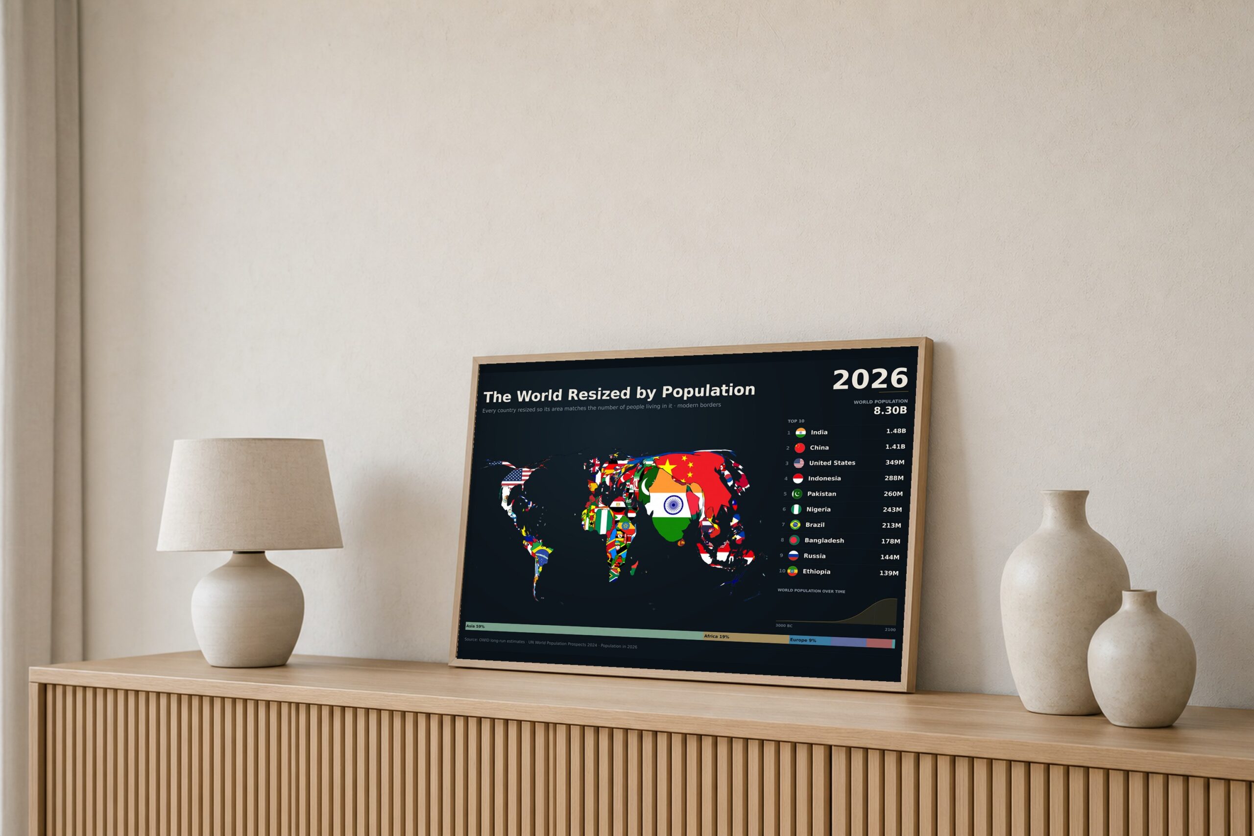
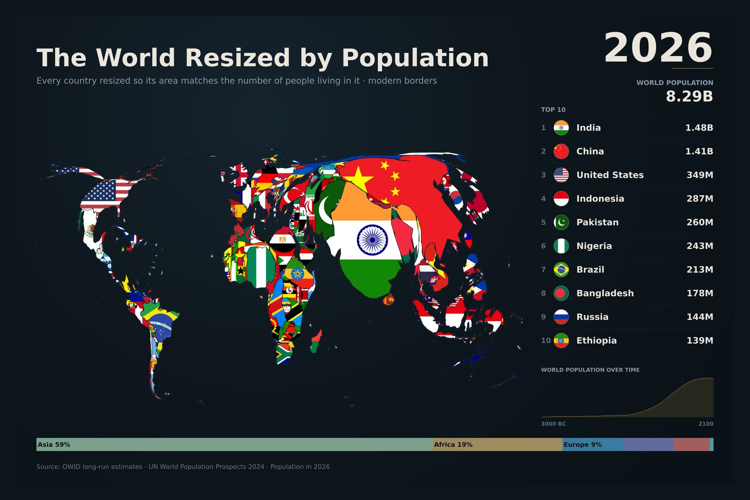
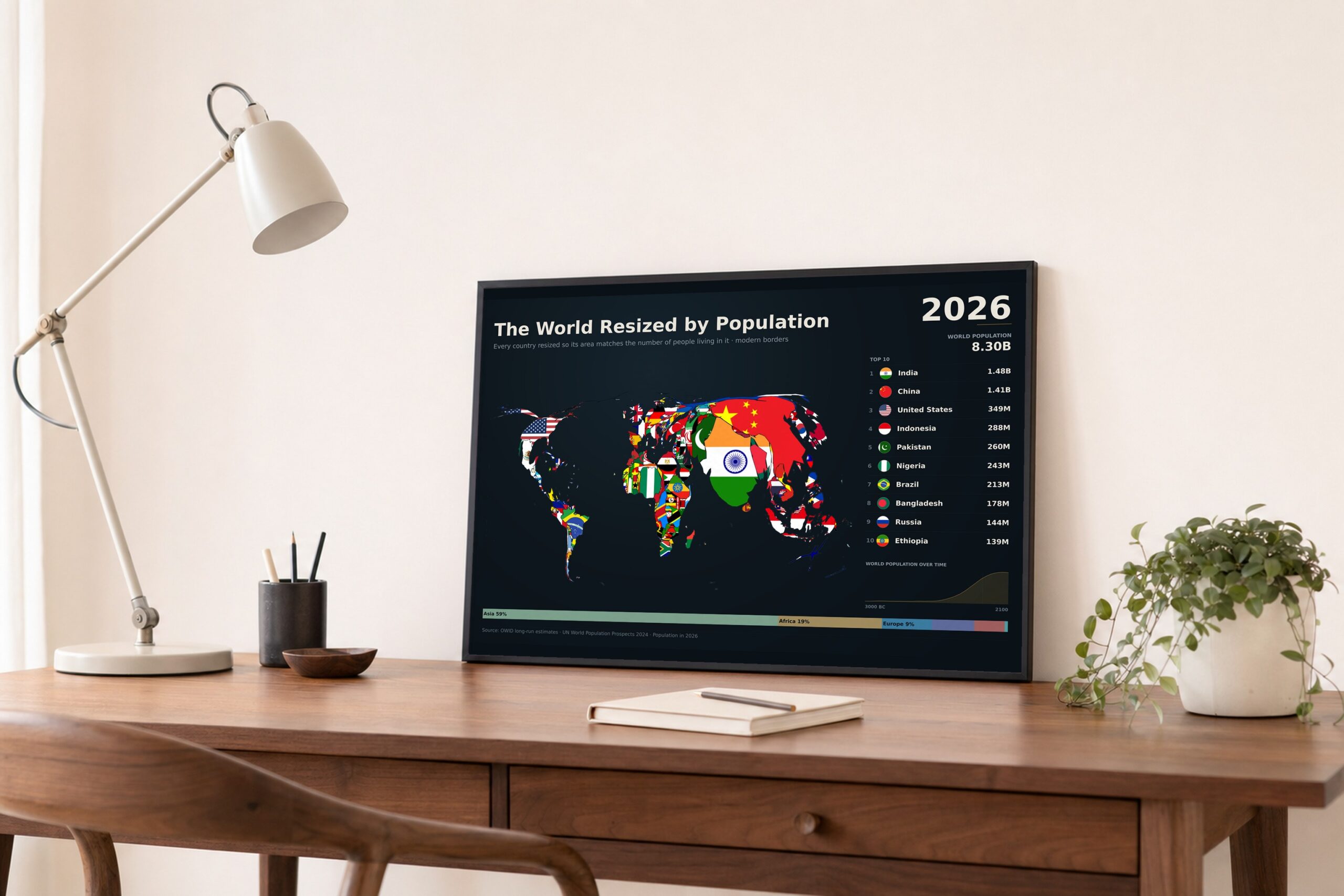
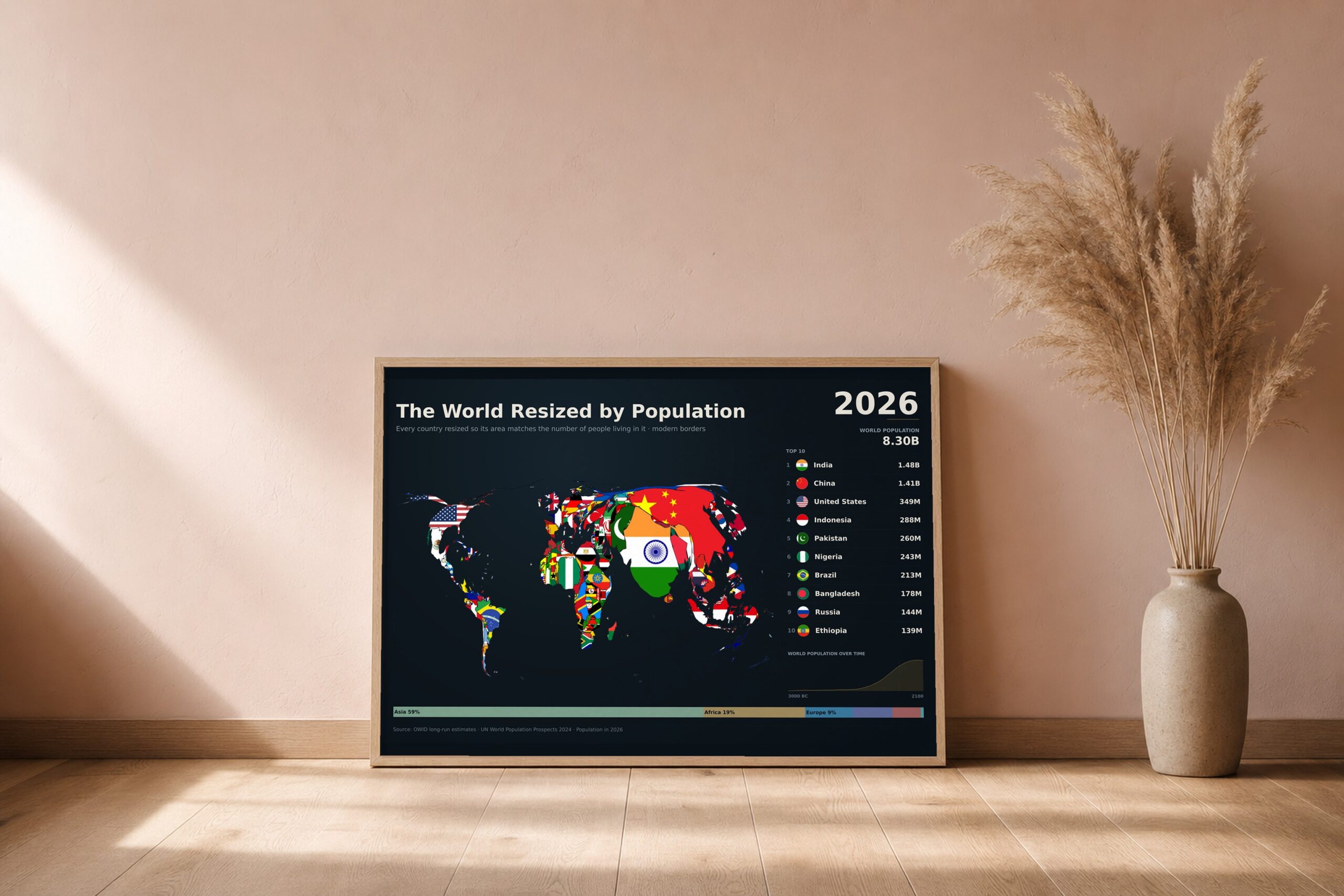
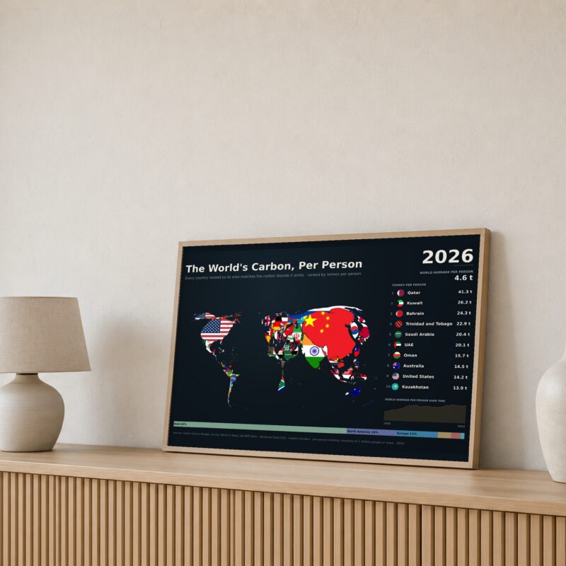
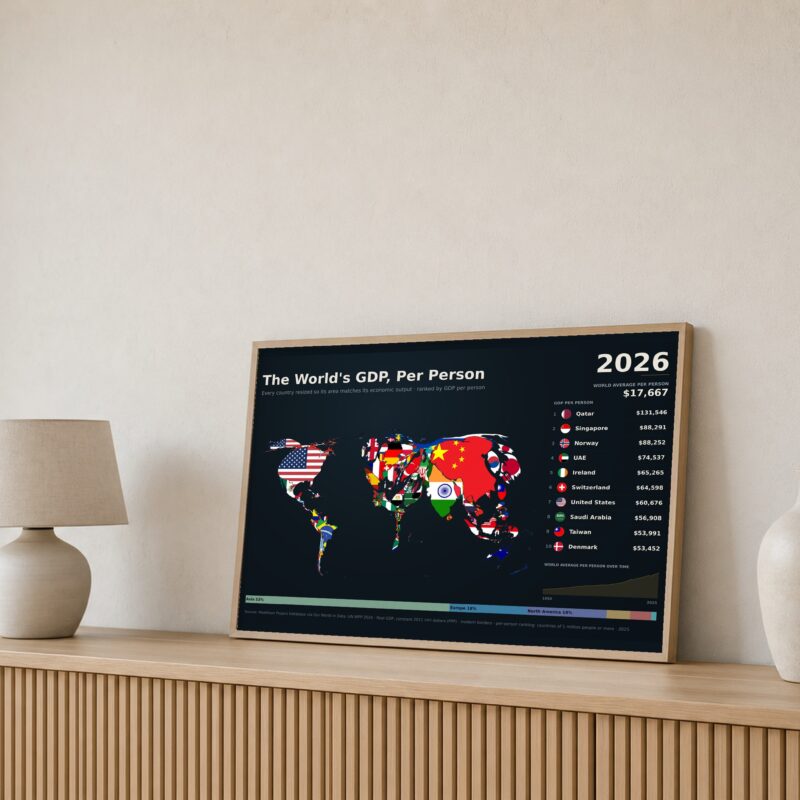
A cartogram: the familiar world map, deformed so that each country is drawn at a size proportional to its population rather than its land area. Modern borders, 2026 figures.
The effect is hard to unsee. Russia and Canada — vast on any atlas — contract to slivers. India becomes the largest shape on the map. Nigeria, Bangladesh and Indonesia read as the giants they are. Alongside the map sit the ten most populous countries and the world’s population from 3000 BC to 2100.
What you get: the finished poster at 24×16in, 18×12in and 12×8in (300 dpi PNG), a print-ready PDF, and a short guide to getting it printed well.
Data: UN World Population Prospects 2024, with long-run estimates from Our World in Data.
Reviews
There are no reviews yet.