
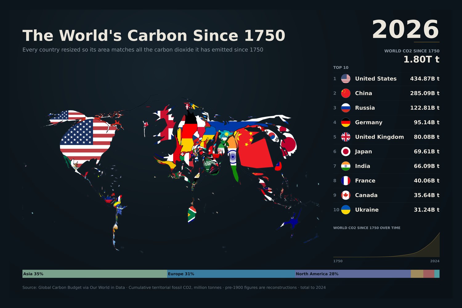

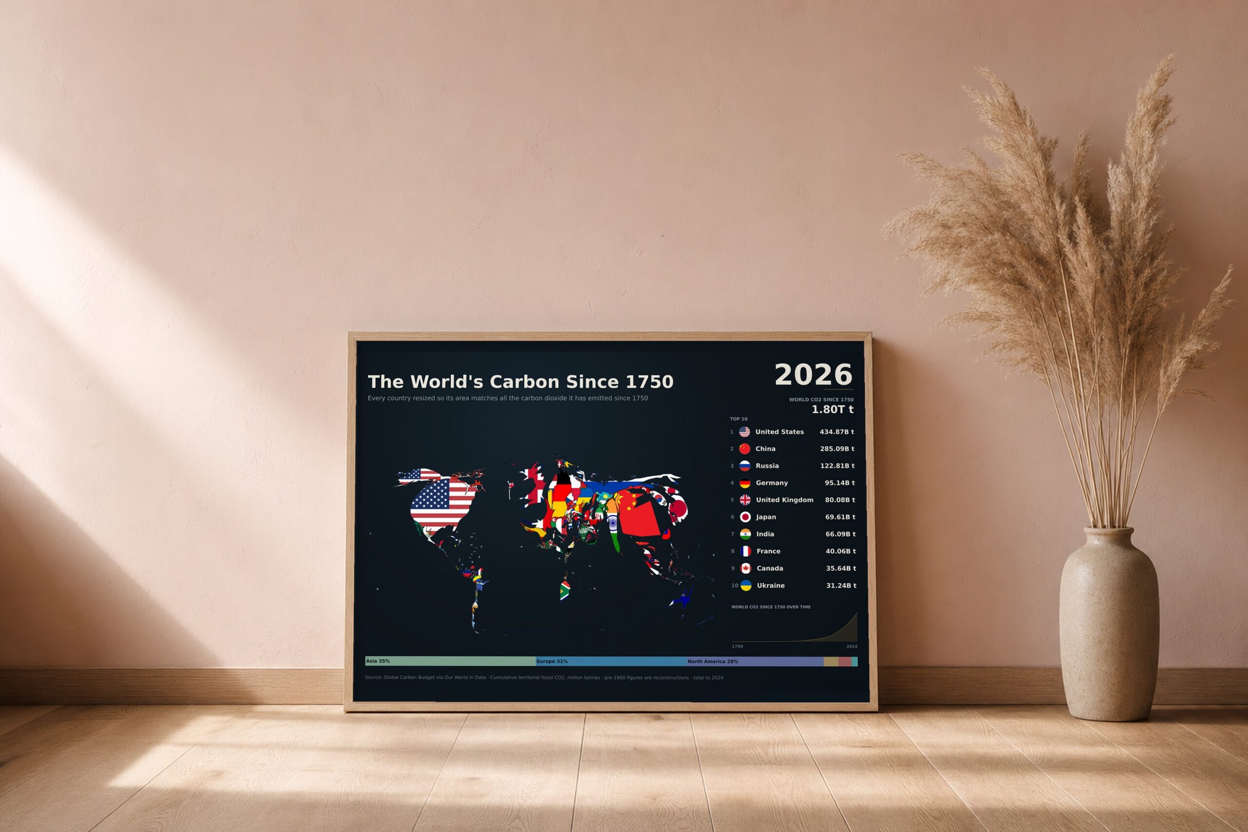
A cartogram: the familiar world map, deformed so that each country is drawn at a size proportional to its cumulative fossil CO2 emissions since 1750. Modern borders.
The United States has emitted 434.9 billion tonnes, more than any other country. China follows with 285.1bn, then Russia (122.8bn), Germany (95.1bn) and the United Kingdom (80.1bn). The world total is 1.80 trillion tonnes. Alongside the map sit the ten largest historical emitters and the running total since 1750.
What you get: the finished poster at 24×16in, 18×12in and 12×8in (300 dpi PNG), a print-ready PDF, and a short guide to getting it printed well. The print option is a premium matte poster, 16×24in or 12×18in, printed and posted to you.
Data: Global Carbon Budget via Our World in Data. Totals run to 2024, the latest published year.