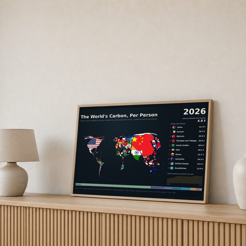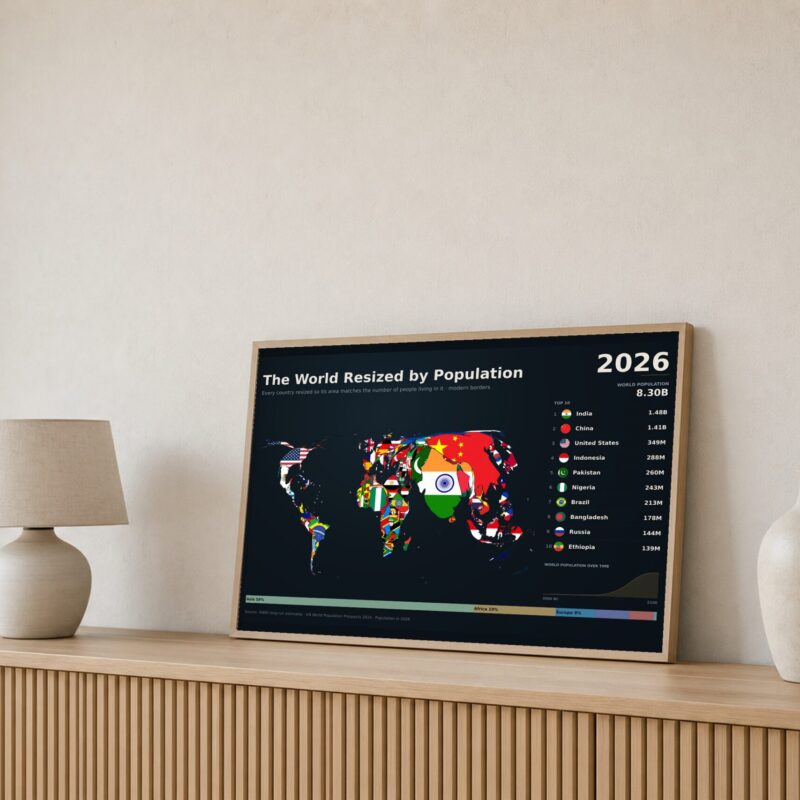
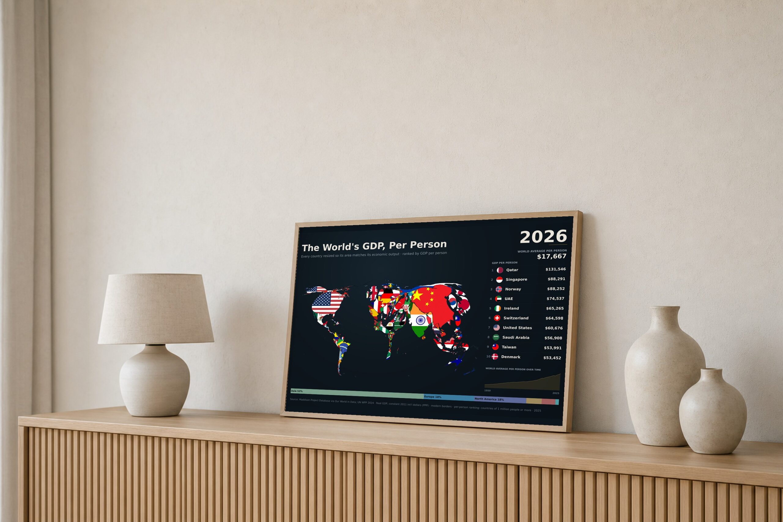
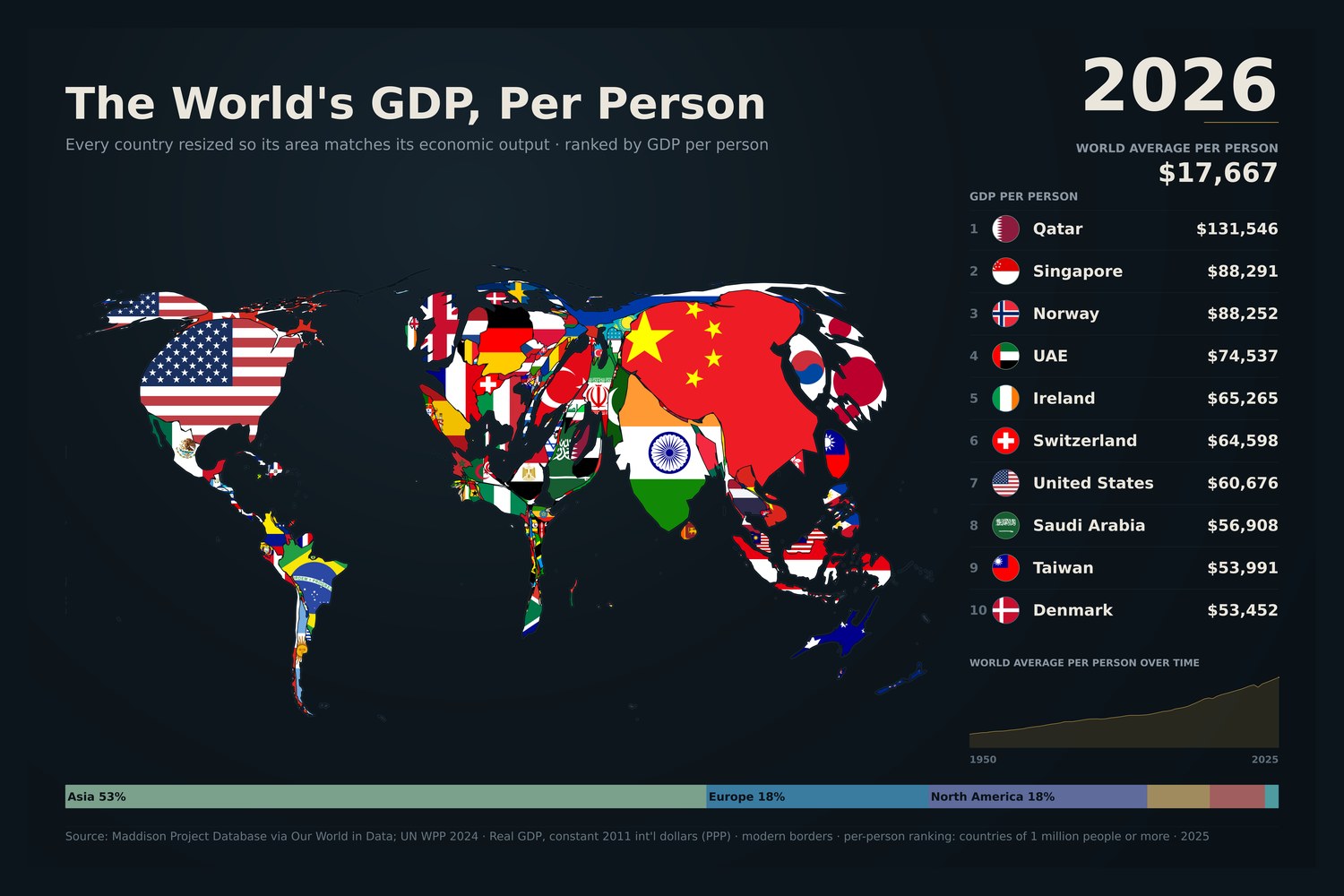
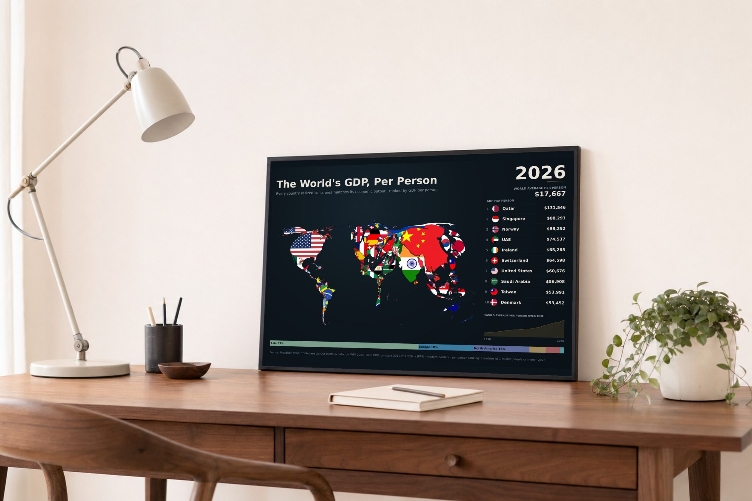
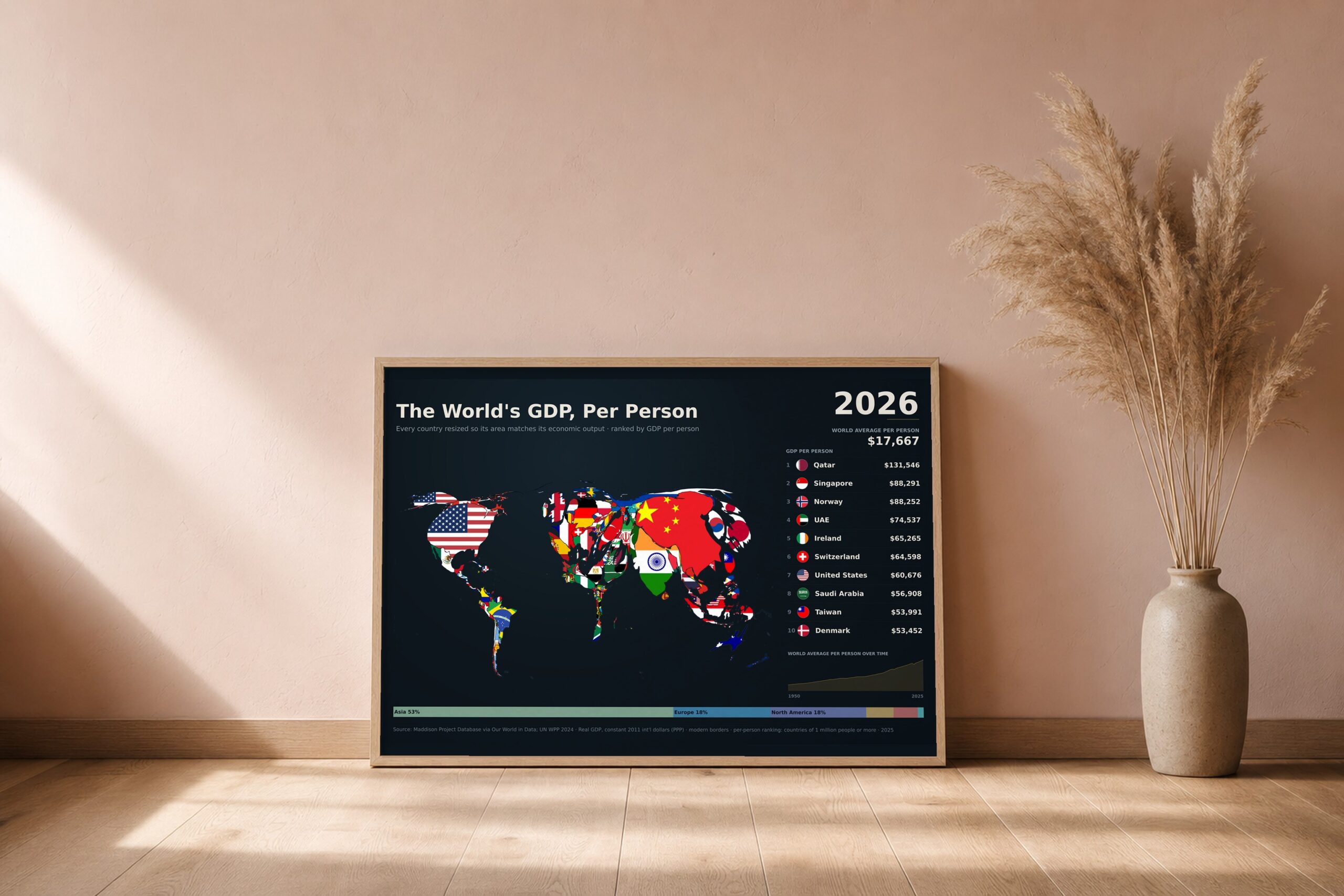
A cartogram: the familiar world map, deformed so that each country is drawn at a size proportional to its real GDP at purchasing power parity. Modern borders.
The ranking beside the map shows output per person. Qatar leads at $131,546, followed by Singapore ($88,291), Norway ($88,252) and the UAE ($74,537). The United States is seventh at $60,676. The world average is $17,667, in constant 2011 international dollars. The ranking covers countries of 1 million people or more.
What you get: the finished poster at 24×16in, 18×12in and 12×8in (300 dpi PNG), a print-ready PDF, and a short guide to getting it printed well. The print option is a premium matte poster, 16×24in or 12×18in, printed and posted to you.
Data: Maddison Project Database (via Our World in Data), extended to 2025 with World Bank real growth rates. Population from UN World Population Prospects 2024.